Choose a more elevated living room color story with refined neutrals, jewel tones, warm woods, monochrome layers, and designer-friendly palette combinations.
- Luxury palettes usually feel strongest when they are edited and layered rather than overly colorful.
- Texture, finish, and lighting matter as much as the base color choices.
- Choose one dominant palette direction and let the accent tones support it instead of fighting it.
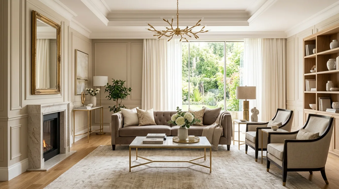
1. Start with refined warm neutrals
Beige, ivory, and soft taupe create a calm base that lets texture and shape carry the room. This approach feels timeless and especially luxurious when the finishes stay soft and tonal.
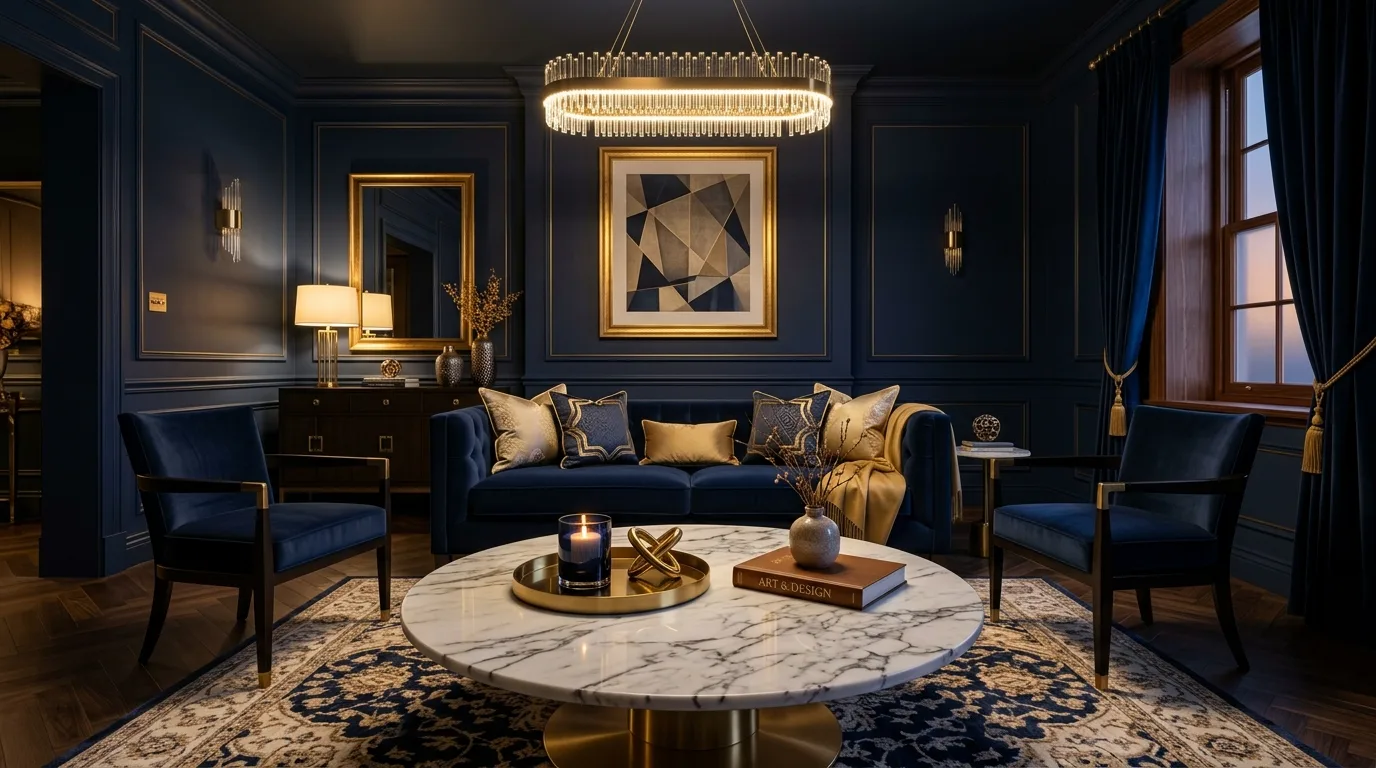
2. Use deep navy with gold for tailored drama
Navy creates depth without feeling flat, and gold accents add a classic luxury contrast. It is a strong option when you want the room to feel sophisticated and a little more formal.
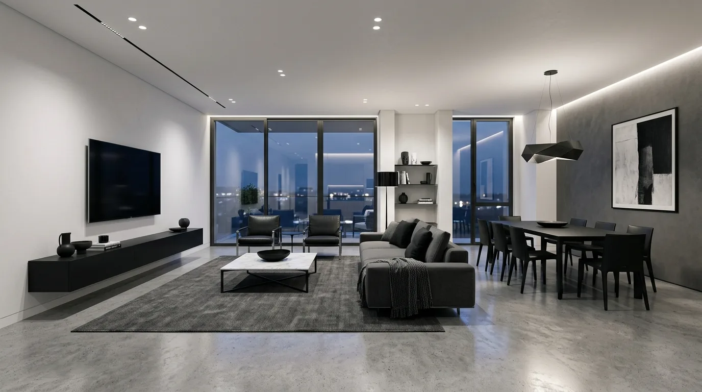
3. Keep monochrome black, white, and gray polished
A monochrome scheme can look very expensive when the room includes enough variation in finish and material. The secret is making the palette feel layered rather than stark.
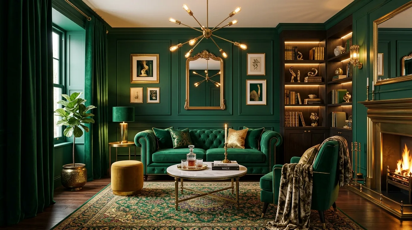
4. Try emerald and brass for richer glamour
Emerald green brings depth and personality, while brass warms the palette and keeps it elegant. This pairing works beautifully with velvet and other tactile finishes.
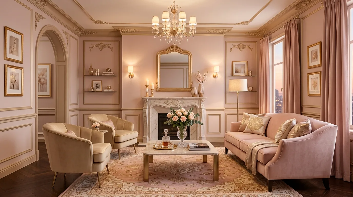
5. Soften the room with blush and champagne
Blush can feel surprisingly elevated when it is muted and paired with warmer metallics. This palette creates a lighter, romantic version of luxury without feeling too sugary.
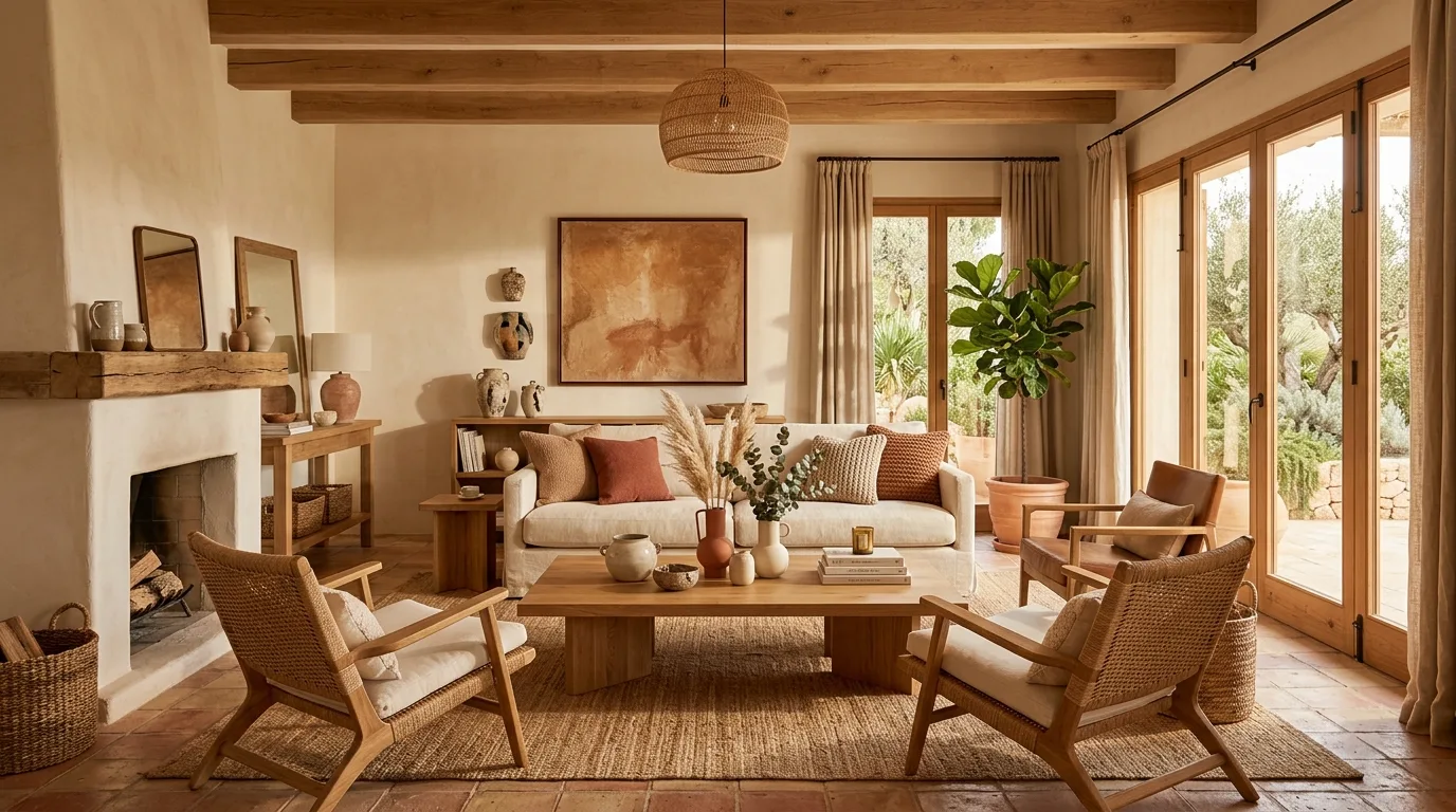
6. Use terracotta and cream for warmer elegance
Earthier tones can still feel luxurious when the palette is balanced and the furnishings are refined. Cream helps keep terracotta feeling soft instead of too rustic.
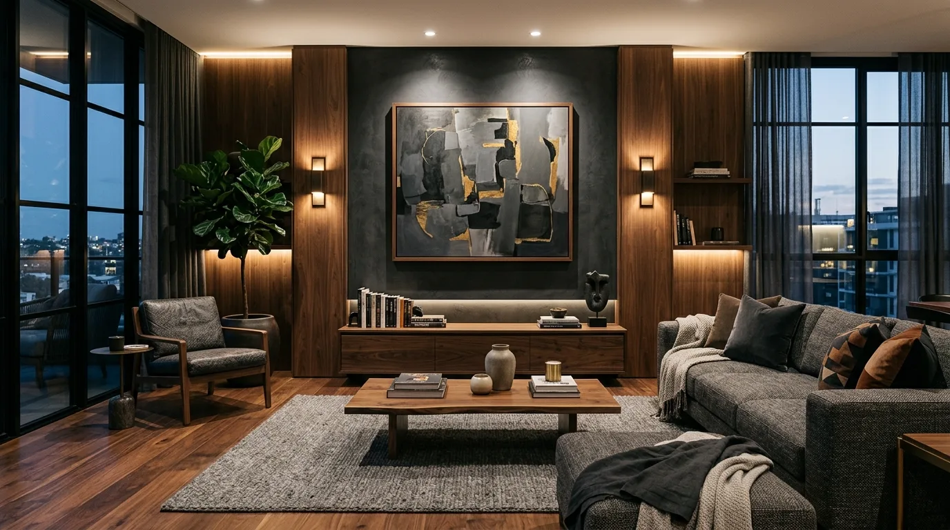
7. Pair charcoal with warm walnut
Charcoal adds mood, and walnut keeps the room grounded and inviting. Together they create a designer palette that feels cinematic rather than overly dark.
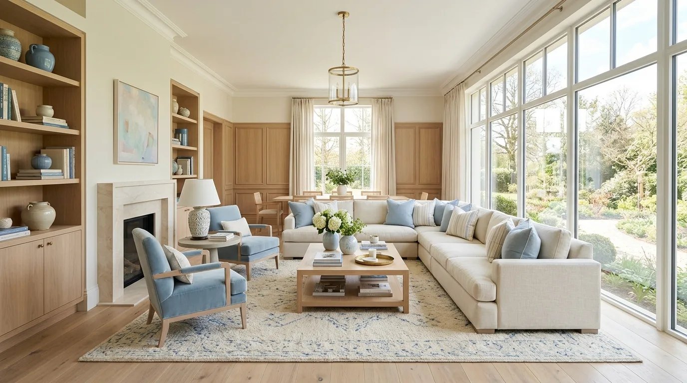
8. Keep pastels airy and polished
Soft blues, creams, and pale woods can look quietly luxurious when the silhouettes stay clean and the palette stays controlled. This is a great way to create elegance without heaviness.
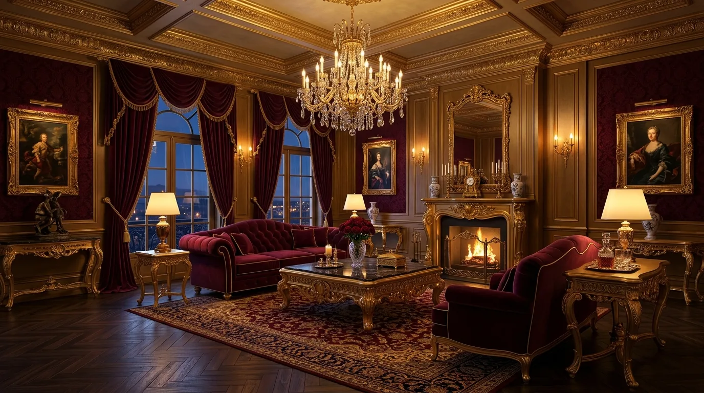
9. Choose burgundy and gold for richer evening drama
Burgundy has a more classic, formal luxury feel than brighter reds and pairs beautifully with warm metallic accents. Use it when you want the palette to feel bold and enveloping.
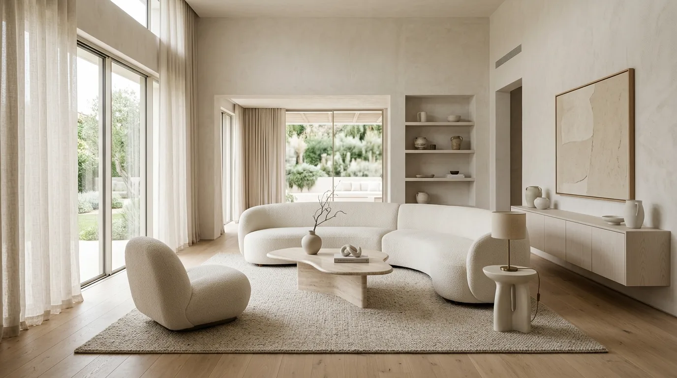
10. Off-white and sand can still feel high-end
Minimal palettes often feel the most luxurious when every tone is carefully tuned. Off-white and sand work best when the room relies on sculptural furniture and quiet texture instead of color contrast.
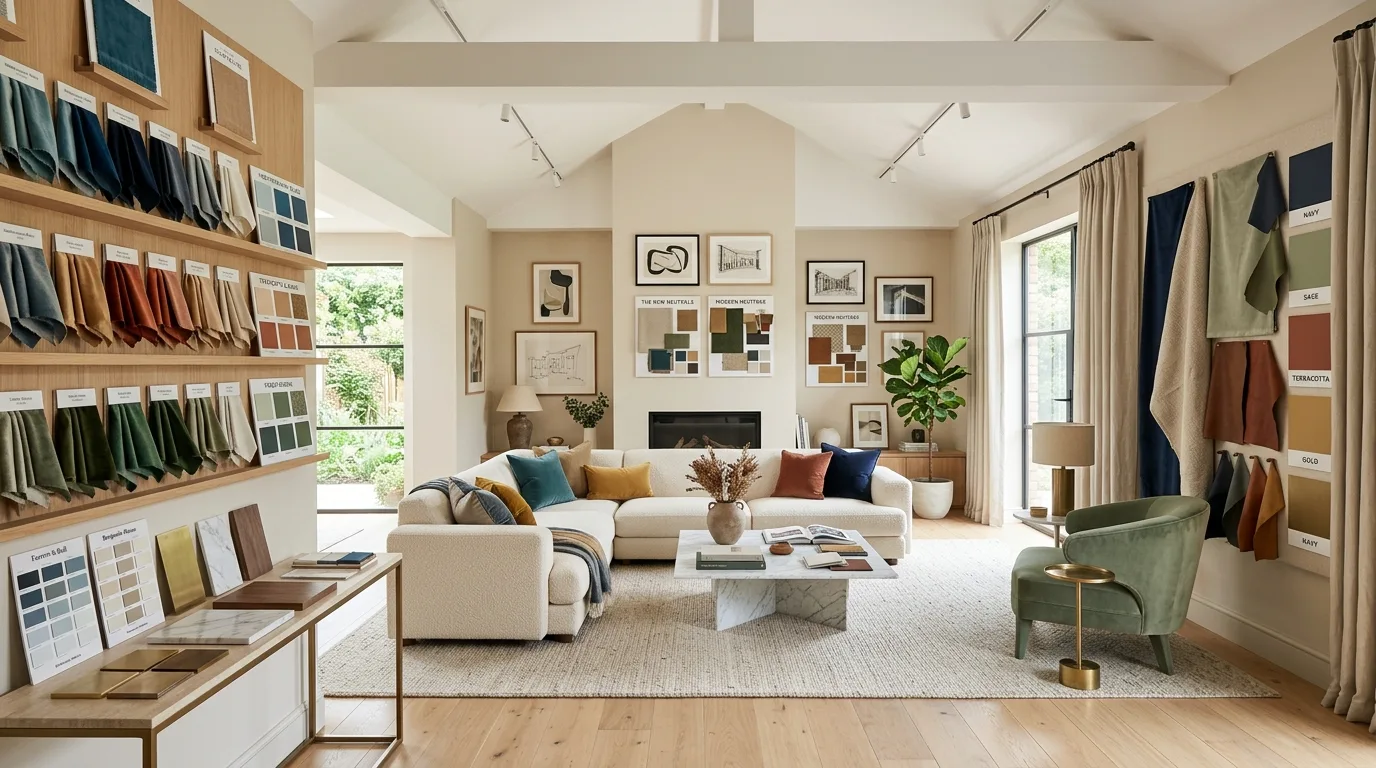
11. Compare palettes through styled zones
Sometimes the best way to choose a luxury palette is to see a few strong combinations side by side with materials and decor. It helps clarify which direction feels most natural for the room you want.